Thursday, February 28, 2013

Farewell... to February!

February was a busy painting month focused upon creating smaller portable items for our the rapidly approaching May opening of our outside Gallery! Many of those subjects were winter subjects, so to achieve better variety and balance in our offerings, I will be focusing upon other seasonal subjects... but again less expensive... portable and are thematically and identifiably based upon the Thousand Islands and Rockport.

This past week, I began that process and produced some smaller works which we will offer as originals... but in some cases... we will be creating new and tourist-driven products which are reproductions of select images which we believe best create both  interest sales potential to clients and visitors. People who are on vacation and are travelling have limited space and funds to decide upon making purchases. We hopefully are addressing those two important factors. Time will tell.

We are as well busy with the process of updating the images and text within our new web site. That will be accomplished by late next week. Time seems to be evaporating... so I certainly will be downscaling my posting, but I will post new images as they come off the easel. I will however be focusing less upon the amount of text and the "journalling" aspect of the blog. One cannot service or devote the required time for  both the work and the writing. The work pays the bills and like all small businesses, bills are a fact of life. So work will be on the front burner for the timer being. I much enjoy the writing too and the sharing of ideas and processes. There will be ample time in the six month off-season to play in that area.

So here's a little something from this week... a bit of work   and time out to play (with paint)... of course! Enjoy!


 "An Idyllic Island Indian Summer Day" - water colour on paper 5x7 inches


"The Real RCMP Musical Ride".... Tim Horton's in hand. Maybe Tim Horton's should consider creating 24 Hour Ride Thru's! HA HA!!!

 A playful poke at our RCMP and their world famous mounted Musical Ride...  Just for fun!


A punny take on Canadian Idol and Teen World Heart Throb... Justin Beaver! Do "dis" intended... towatrds the Beaver! HA HA!!! I'll bet he drinks an odd Tim Horton's as well... as every other Canadian!! It too... is a Canadian Icon!


Good Painting... to ALL!

Sunday, February 24, 2013

"Silence"... can indeed... be Golden!

Too much of my own energy lately has been devoted to... and focused upon my own painting and my own  preparations for a (too) rapidly approaching May opening here at The Paint Box Gallery. In order to succeed in this six month economy and small window of opportunity for sales... we must have most all of the inventory of product ready for this opening  month. January and February has been a "heads-down... nose to-the-grindstone" time for both Deb and I. We  meet briefly each and every day  for our morning coffee ritual... again for a quiet lunch together... a cribbage and supper rendez-vous and a cracklin' fire and TV end to our day. In between those times... we each are absorbed totally in our own artistic pursuits. We do conference and collaborate for input and direction... but basically... we both have jobs and work to be done. Our success in the Gallery depends upon the presence of both our crafts. "We"... are in a word... a team!

This morning... my "voice" will be silenced... in order that a major "happening" can be properly celebrated on its own merits. Your eyes and hearts are the only thing necessary to grasp the larger and fuller meaning of what 

I have just said. It is not my accomplishment to be celebrated this 
Smorning... it is with great joy and admiration that I offer to my friends this very singular and outstanding achievement which belongs to my wife and partner Deb. Her humility is somewhat of a drawback most of the time. She seldom asks for the kind of reassurance and back-slapping that most of us seek out. She simply... cuts... grinds and assembles her glass... piece-by-piece... until the likes of this grand church window commission looms before you. IT is then... at that moment... that you come to understand... that "silence... can indeed... be golden."

I salute "You" Dear Heart... as your husband... your greatest admirer perhaps... but as well as someone who respects only good Art... "Art" completed with passion and with great humility. Those are the key ingredients which separate you from the makers of "sun catchers"... from someone else's patterns and ideas! I am proud to share my life... my time... and my dreams with You!

Love "You"... "to the moon and back"... and Forever!

Bruce
XXXXXOOOOOXXXXX


This window was commissioned by a family Rockport's "Summer People" who hail from South Carolina. This entire family have attended The Church of the Redeemer Anglican Church in Rockport for over fifty summers and are an intricate part of the beautiful-turn-of-the-century small parish church. The father of this remarkable family actually was a minister and regularly conducted Sunday Services at the church.

Sadly... he was suddenly stricken and passed away leaving a huge, empty space in an otherwise idyllic summer lives of his family. His wife and daughter approached Deb last summer... having admired her stained glass artisanship and asked if she might consider the task of undertake the creating a memorial stained glass window in honour of the husband... father and family. It would then be a record of their joy and fifty year presence in this church and their beloved Thousand Island summer retreat.

The window will be dedicated when they return in the early summer. It will stand as a monument and testimony to their lengthy presence for certain. It will as well give testimony to the humble, but gifted presence of the window's creator... Rockport "newbie"... Deborah Lynn Price-Sherman!

I am deeply blessed on this day... to share her remarkable journey! "She"... is definitely... in  my humble opinion... "A Cut Above"... the rest!

Friday, February 22, 2013

Making the Most... Out of Miniatures

The title might be misleading... if you are focusing upon the word "most" to refer to the money value of a miniature in my thoughts.That word "most" connotes other essentials for me in committing to painting miniature paintings. I will try to advance some ideas which describe the other aspects of miniature painting for me.

Firstly... my "career" as a selling artist began in 1972 at a kitchen table with a $0.69 set of watercolours which I purchased at K-Mart and a 9x12 inch pad of cheap watercolour paper. Does that sound familiar at all? I punched out a lot of questionable work that today (yes I still have them) reminds me of the point where I began my journey... to arrive at Today. I discovered a process through my own playing and enjoyment of creating 5x7 inch watercolours of barns and other historic buildings... which were the focus of renowned artists I admired at the time... Eric Sloane, Andrew Wyeth and the Canadian Ken Danby. I had always loved barns for some strange reason... perhaps because our area was steeped in a United Empire Loyalist tradition of barn and stone house building.

I came up with an idea to mat these miniature watercolours in coloured mat board... cutting the opening with a Logan hand cutter... and wrapping them in Saran Wrap. I decided to "try my luck" sitting on the local farmers' market on Saturdays offering  my weekly output on the pavement...at $12.00 a heave. I had a box load of these "puppies looking for a home"... and sold all of them on my first time out. It was not the $$$ which generated the enthusiasm with which I took up the task. It was purely the thought that others valued what I was producing for enjoyment. It was not a job which created this windfall... it was a joyful and enjoyable evening past time. It was like reading - a zone where one receives enrichment of the mind and soul... but you get paid for it - an "Epiphany" !

I joined The Kingston Arts Council and soon became an exhibitor at their three time a year sales events like Fanfayr. I gradually I lifted the price to slow down the demand and began to add pen and ink to the images for punch and detail to in my own mind... justify the cost increase. Later on, I  added frames and experimented with pure white lithographic papers which amplified the contrast between the colour and linear ink rendering. The work continued to sell out... and during the course of these shows, I was approached in 1978 to commit to a solo show with Gallery Francoise and The Glebe Studio and Gallery in downtown Kingston. It was through the encouragement and urging of these two women curators and owners that I began slowly to add "larger" works. And so my career as an artist was launched.

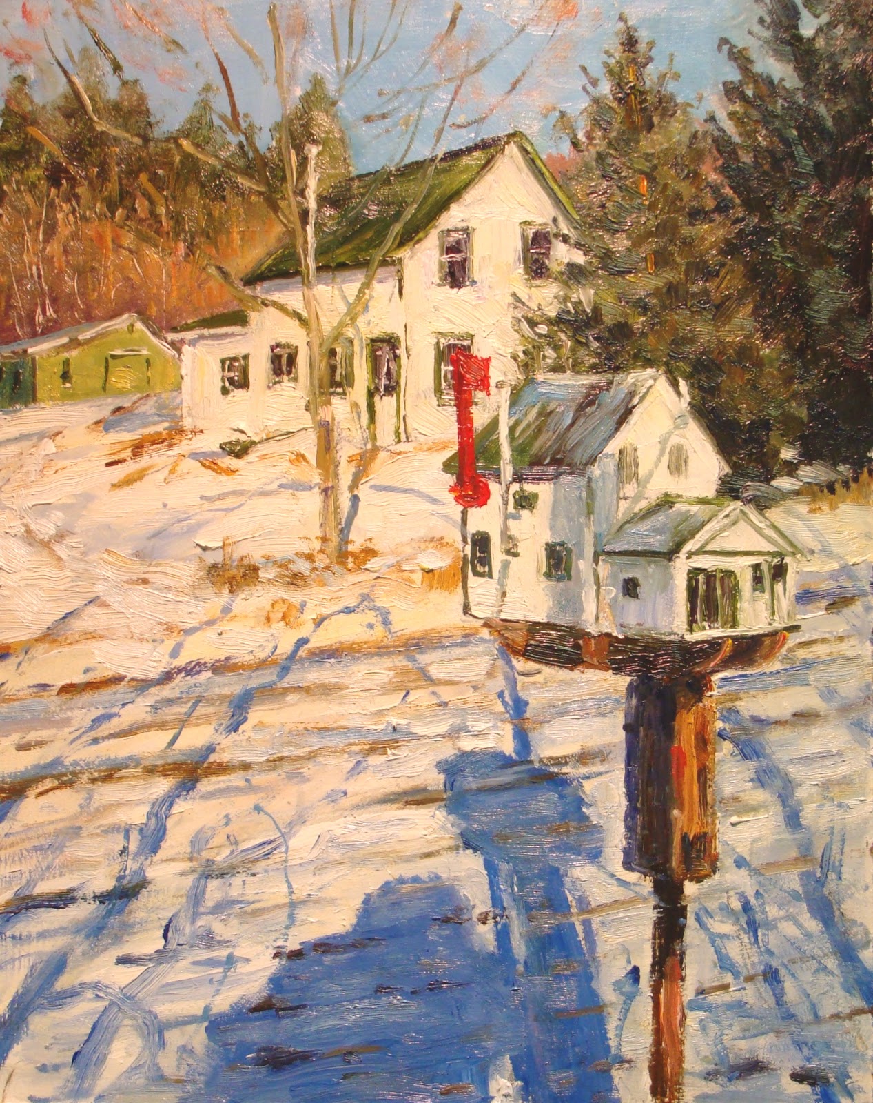
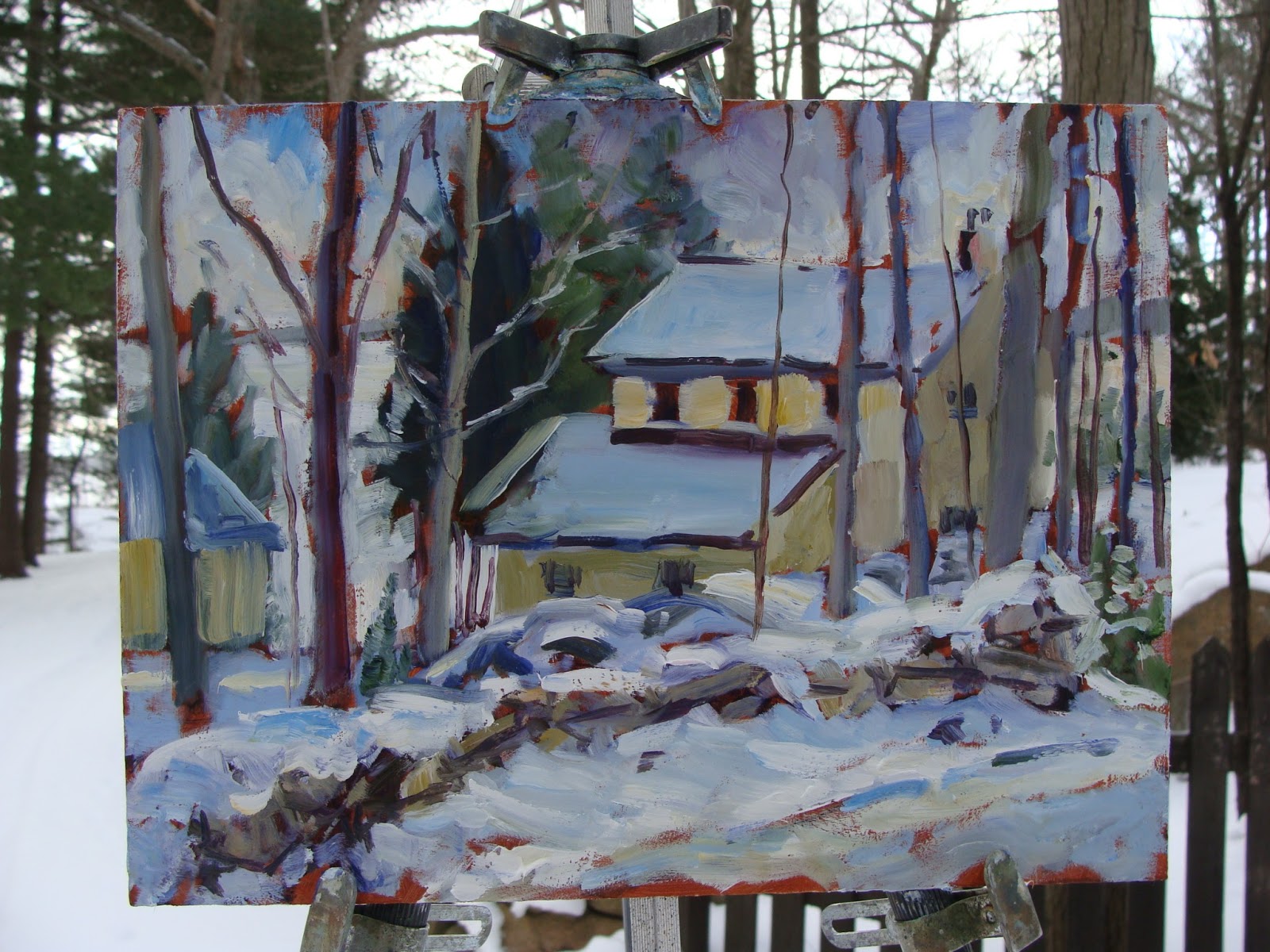
 Over my career, I revisited the production of these small miniature formats... but just to add variety and grouping opportunities to my solo shows. I had run the gamut in producing them solely to gain a reputation and following who were familiar with me and my work and found the small format to be uninspiring... even discouraging as I went to the bigger canvas formats and as well to painting mostly en plein air. My version "small" in the field remains even today to be 8x10 inch or 10x12 inch toned panels. I customarily either begin or end my day of painting with one of these smaller panels... and I always refer to them as "sketches"... "exercises or ideas" which could lead to larger explorations in the studio.

So strangely... I feel that ... in a way, I am "back-tracking", or have come full circle back to where the journey began. However, in comparing samples from those earlier years to these recent examples, I can readily see vast differences in technique and quality. There is a liveliness in these recent pieces that is quite identifiably absent in most of the original prototypes. Before, the object of the activity was to simply fill a quota to be ready for the next outing. While I did in fact try to produce the best work I could... given my limited experience using the medium and technique, it is fair to mention that speed was a considered element in their creation. As a result, bad decisions and outcomes were made... and when rendered in ink could not be eliminated. I would gladly love to have many of them back to give them an unearned Viking funereal ending. But all of us wish that to be true of our earliest paintings.

I am offering a few of the original pieces dated 1974 to compare with the two most recent painted yesterday. You be the judge... and jury regarding what lies before you. The lesson all of us can draw from this post I hope is that one's artistic journey is ongoing.and without end if you wish it be so. By simply painting... painting... and painting some more we grow exponentially. If we add into that painting activity...  mentorship by people whom we trust and admire and travel into the formula, we can see that our growth can be sustained and continued for as long as we wish to reach out... and learn more.

In my next post, I will discuss some plans that I wish to undertake which reshapes my new "taking up of the small format gauntlet" to grow it into something altogether different. I as well will add my reasons for making such a decision and what I hope to accomplish by this venture. I believe that my actions are quite rational and that they are a measured and totally justified response by "Me" as a creative individual to a different economic time and need in my life.

Stay tuned!... Hope that you enjoyed the paintings and the post content!


This is a plein air watercolour of the old blacksmith shop (now gone) in Delta, Ontario. Being too much in a hurry is plainly revealed in the impossible placement of the two second floor windows of the facade... clearly and awkwardly above the roof and attic area. Great detail in the shop itself... not much attention to background points to more hurrying . A dismal effort!


Discovering the Rapidograph Mechanical Draftsman Pens set led me to a couple of years of experimentation with the pen as my only interest. I did large scale pen and ink architectural and still life renderings which really improved my draughtsmanship... and slowed down my too compulsive need to work quickly! Planning was essentail and became  the hallmark of these large scale drawings. I later moved this knowledge into my water colour work and the two married well and created contrasty and colourful artwork.


This is an early pure watercolour study en plein air of a Gothic Revival style home located in the historic "Sydenham Ward" on William Street in Kingston. I really loved the symmetry and balance as well as the "gingerbread" woodwork in the dormer and along the eaves. Much better control inside of two years of work!


 This is a "folksy" rendering depicting our summer home just east of Rockport, where my family and I summered for over 53 years. This was one of a pair which I did as a Mother's Day gift in 1976 for Mom... and a picture of my Dad's family home in Maitland, Ontario. Hurried as well... last moment decision, I guess. Life got in the way... even back then


This is the other of the pair depicting my Dad's family United Empire Loyalist homestead located in Maitland, Ontario. It was a Father's Day gift given in 1975. This combination of water colour and ink better demonstrates the kid of control and attention to detail that I could come up with.... minus the deadline! Both hung together in our beloved cottage until it was sold.


This is again a straight transparent water which demonstrates my found ability to use strong contrasting  lighting effects and the capability to actual dry brush and render with the pigment over layered washes.Pure watercolour can now be seen to hold my interest., The ink run is over.


This is a pure transparent watercolour... and a good example of the kind of watercolour I could produce in the late eighties and nineties. This was a favourite lighthouse and is located in Rustico, Prince Edward Island. I kept this  for myself and I intend to paint this one again very soon... as a memory of my five year residency in Nova Scotia and my travels and adventures  around the Atlantic Provinces.


This is the most recent 7x5 inch watercolour and ink Rockport  Spring painting. It depicts the Captain Carnegie historic house... past home as well of Ed Andress the wooden boat builder, grandfather of my landlords Wendy and Art Merkley. It is light and airy and has the same warmth and good amount of detail seen in the previous day's work.


This was my second effort from yesterday... a winter view of St Brendan's Roman Catholic Church.. high above Rockport's harbour. The same  consistency of warmth... colour and draughtsmanship can be seen throughout the last four pieces... something that would have been difficult for me to achieve back in the seventies. I choose to be loose and jaunty to add to the painting quality. It would appear that time and continual painting can indeed result in learning and proficiency in a medium. Jumping all over will never lead to this point. Focus!... Focus!... Focus!

Hope that you enjoyed this trip down Memory Lane with me! I hope that it encourages you to stay the course... to work hard and to be patient in your desire to grow! It does not come over night to any of us.You get from anything... what you put into it!


Good Painting...  to ALL!

Wednesday, February 20, 2013

Summertime Dreams...

I have painted through most of February... focused solely upon winter both en plein air and in the studio. I thoroughly enjoy winter as a theme for my paintings because things in the landscape are either transformed by the presence of snow... or they are brought into view when they would normally be overwhelmed or covered by foliage in the other seasons. Elusive light and shadow play together dramatically at the beginning and end of each sunny winter day... making interesting and challenging subjects to paint. I never really tire of winter, but many other people do not share enthusiasm... and many of them shun such paintings on their walls.

A good portion of our clientele are summer residents or visitors who worship the things which summer affords them. Enjoying the freedom to move about without having to be layered in heavy winter clothing and
being able to spend greater amounts of time engaged in summer-only activities such as boating, fishing , gardening, sun bathing and travel during vacation times. The last thing most of these sun-worshippers want to look at... is a painting reminding of the long winter cold!

So, I have set to work on a necessary project these past two days creating  paintings based upon other seasonal themes and especially focused upon summer in Rockport. They are quick... loose... painterly little ditties which I first paint in watercolour washes and then enhance with ink rendering to create contrast and detail. People seem to enjoy them.They are portable... less expensive and souvenir-based. All of these characteristics make them highly saleable in our Gallery.

I plan to do one or two each day in the mornings... and (hopefully) reward my Self with afternoon work opportunities on larger canvases, both en plein air and in the studio. This reward system will keep me motivated to carry out this necessary task and at the same time provide new material for both kinds of visitors.

Here are the first two "pot boilers."... These can hardly be classed as  full scale works of art, but nonetheless, have a jaunty and colourful presence! I enjoy the "puttin' along.... Hope that you enjoy them!


Good Painting... to ALL!!!


"The Rockport General Store and Gift Shop" - mixed media w/c and ink on paper 7x5 inches


"Up Cornwal Lane, Rockport" - mixed media w/c and ink 7x5 inches

Monday, February 18, 2013

Go Fly a Kite!....

No... this is not a sarcastically delivered invitation to "get lost"! It is intended to invite you to see a spectacle beyond any expression which words could present. It is a visual... musical and deeply moving account which exemplifies to "Me"... the great difference between passionate"artistry"... and banal  imitation. When you have witnessed this kite ballet... tell me... that you were not moved to tears... awe and wonder.


When you or I... have gained the mastery and knowledge "to fly our own kites"... with such passion and skill... then we too... can then rightfully call ourselves... artists... with some degree of entitlement. Until then... let's just keep practising... and enjoying ... "the flight.


For some reason of copyright... they will not allow me to download this to my blog. But if you trust my judgement... your effort to simply Google Professional 3 Kite Flyer Ray Bethnell... will blow you away! It's art... beyond words... and inspires!


Good Painting and ... Fair winds to All!

Saturday, February 16, 2013

When Small... Can Become Big!

Today, I painted another small 10x8 inch toned panel... not unlike the ones I had painted in the challenge - except... that I had a strong emotional commitment to making the painting. This is to be a "Welcome Home" gift for my daughter Allison, who has been away doing further research in Venice. She is on fellowship and is currently in the process of writing a textbook for use in university and scholarly study and is based upon her doctoral research. We have missed her... and plan a combined birthday and Valentine's Day celebration and "sleep-over".... beginning this afternoon!

She and I share a deep love and connection to Venice. I had studied in Venice for eight weeks in the spring of 1989 to complete my own undergraduate degree in Art History at Queen's University in Kingston. That experience was pivotal in my artistic growth and to this day was one of my most important life-changing events. Since my own immersion into that crucible of Western Art, Allison found her own way there... fell under that same Venetian spell... and quite literally... has scarcely left Venice, except to teach in Canada. Ironically... she heads the very Summer School in Venice experience, offered by Queen's which guided both of our Destinies... and launched us into a life long pursuit with our passion for Venice and our own artistic vision. "Be Bold"... has propelled both the young speaker of those words of wisdom... and her ol' Dad to a place..."Up there where we belong...". Music is never far away in a Sherman's life! HA HA!!!

I took the photo reference upon which this small panel is based on another occasion, when Deb and I prepared to have Allison visit in July of this past year. The roses come from our beautiful front garden and the cup was a gift which Allison brought me upon a return from one of her other Venetian forays. It is a delicate and beautiful hand crafted ceramic... which is quite literally and  visually "Venetian". Its face design, created by the dark blue and grey pigments records a view from the Doge's Palace which looks out on St Marco Square and the Redentore. The postcard... upon which the cup and roses sit was her very first gift to me on her first voyage of discovery... her "first footing" for "Her" into a world... which even "I" had found deeply threatening and disorienting in my own experience. To enter Venice initially... is to "time travel" back into to Medieval time. That is the only way I can describe my experience to you.

It seems quite appropriate that "I" honour Allison with this personal votive... one which not only enjoins us not only as Daughter and Father, but as well, travellers who have always shared parallel journeys. Though my travelling days are basically completed... but not at all finished, Allison's magnificent journey is barely under way.


 Dear Allison,... One cannot hold the moonlight... but may you always put your dreams in the Light.... Make visible what without "You"... may never be seen." Love Always, Dad XXOOXX

This is the top of an antique side table which I decorated with images and "iconographic images pertaining to a blended version or medley embracing our common artistic journeys together. I created it to commemorate her gaining her undergraduate degree in Art History. It is but one example of my "off-the-wall" explorations to explore and examine a variety of approaches to "imagineer"... and use art beyond its predictable, expected place hung on a wall.


This is Allison standing on the bridge which she and I both crossed daily to enter The Campo di Santa Maria di Formosa... the quarter where we both lived on Fondamenta Rimedio. That canal lies directly behind her over her right shoulder. The second bridge down the fondamenta is one I crossed the canal to enter my own dwelling. Yes... it is indeed cold and wintry in Venice as well. Ten centimeters of snow greeted her one evening on her return home... plus an expected record-breaking 104 cm rise in lagoon and canal waters in Venice... into the actual homes themselves. Each home is equipped (by law) with an inside  ceramic  liner and sump pump to (hopefully) keep these annual waters from destroying property... and health. All of these facts indicate that... life isn't as "green"... on the other side... as we think!   


The title for this painting  is a thought borrowed from the Chinese philosopher Lao-tzo c.604 AD

"The greatest journey begins with a single step"... which translated into Italian reads on this painting au verso:

"Il viaggio piu comincia con un piccolo passo."  

So glad that "You" are home... yet still voyaging Allison!

Much Love ALWAYS,
Dad
XXXXXOOOOOXXXXX 

Thursday, February 14, 2013

The Real Challenge....

Yesterday, I mentioned that I struggled throughout the entire painting of the subject for Challenge #13... "The Red Canoe." Yesterday in my post, I chalked it all up to weather and lighting conditions. Over the course of my early morning coffee routine, I came to realize that although I was indeed painting more regularly than usual, the challenge limited me to smaller painting projects to conform to the time necessary each day. As well, I had several larger format paintings which I had been considering... and this format prohibited me from getting my teeth into theses.

My art has never been an area of my life where I required much, if any encouragement to get at it. I have always been a "self-starter"... with ideas which never stop piling up in my head, my sketchbooks and my very large library of digital references. I have always been able to move through these sources to motivate myself and was never short of good subjects. I found this Challenge project to be difficult to juggle with my personal life responsibilities. I found the experience increasingly draining as it proceeded.

All of these things said... I wish to restructure my Challenge goals, not to paint continuously over thirty days to create thirty paintings, but rather to paint over thirty days and create paintings of merit and thought ... that I am proud of. "The Red Canoe"... per say is not such a piece for me personally. It might well find itself in the fireplace as a Valentine evening "cracklin" fire starter... or just a study for a future larger work.

Today, I worked the entire day on "The Winter Willow" piece started... but not finished, a few days back. It is complete for the most part, as of the writing of this post and I truly believe has more to offer"Me"... and "You" than future Challenge 8x10's which I "knocked off" to make the daily deadline. Truth is... "I" am pleased... head-to-toe with my decision. One great painting produced with dedication and proper time... is better than thirty mediocre ones!


 The actual subject... rooted... a few mile east of Rockport


The starting structure... establishing lines... lights and darks in one session


"Winter Willow" - oil on canvas 24x20 inches. it is painted on canvas used to recover canoes like my own. The heavy tooth makes it a challenging surface to lay pigment on... but it really does allow for great textural effects.


The real challenge in living one's life as an artist or even as an individual, is to live it authentically and as fully as you can. Other concerns such as wealth... ambition... and recognition are transient reasons which change as one moves along in life. The first two will sustain one over a life time and in all likelihood, bring some of the other things mentioned as well... without making them primary objectives.

I offer the jpeg of the finished piece to perhaps help you to understand both my dilemma... and my solution. Paint what you feel and have a passion for... and you will always be happy and motivated to sit down to the studio easel... or to head "out there." Good luck with your own choices and journeys!

Good Painting!... to ALL!!!

Wednesday, February 13, 2013

Seeing Red... Both helps... and gets in the way!

The morning started out well... sun shining... no wind... mild - a perfect day to get back "out there." I had seen a scene from The Parkway at the riverside village of Ivy Lea. It would be a perfect day to add this bright one to my Island Challenge series. I was on my way to Gananoque to shop for groceries when I noticed it again this morning and decided to hurry the shopping up and get back home to get my gear together. I decide to take a shot of the subject... just in case the moment disappeared prematurely. It was but a five minute drive back from Rockport to here, but change in winter weather occurs at the drop of a hat.

Conditions were still perfect when I arrived home, but by the time I got upstairs and was just ready to load up... the sun disappeared for the remainder of the day. What replaced it was that flat... uninteresting blah condition where neither shadows... contours are registered anywhere in the landscape. Disappointing... but I decided to have a go at the scene in the studio. At least the image was fresh in my memory and the desire to paint it was still strong.


 Horizontal format... good lighting at first visit


Lighting flattened out... leaving less than stimulating scene
I had decided upon a vertical format to give a strong sense of depth to the painting. The composition would be strengthened by that format as well. I quickly laid in a rough drawing using an ultramarine blue with alizarin to create dark outline. I focused upon the spatial divisions of the shoreline and the islands. The docks added some diagonal interest. I then moved to the painting part... and that was when the wheels seem to fall off the wagon. From that point on everything I tried to do seem to go awry. It climaxed when the panel fell off the easel and flush against my navy shirt... leaving quite mess and smudged areas  on the painting. Needless to say, I felt discouraged and deflated... even considered "scrubbing it"... something I very rarely find necessary.

It was a great time to take an early lunch and I did... glad to be away from it. I even prolonged the away time by preparing the evening meal, just to avoid going back down there. I finally garnered enough gumption to head back down and I simply bit in... and decided to push through, irregardless of the outcome. Within a few minutes, the Flow returned and pushed through to the end. I feel the essence of the subject is intact, as is my feeling of not being beaten. The painting, I will admit could be stronger... perhaps in a larger format... on a better day! We'll see.

When searching for winter subjects, one of the common complaints of so many artists is that there is too much white. Similarly, they complain about ... deride and avoid the summer greens - too much green! My strategy for both situations is the same. I look for buildings usually which sharply contrast whatever i=s missing ion the season. Red works for me in both situations and I use it often to create warmth and high colour interest. I even heighten its chroma... to exaggerate its presence.

The other strategy I often use ... is to swing the light and use it dramatically in whatever way I wish to use it for dramatic effect. One must have had some considerable outdoor experience to accomplish that. Seeing certain lighting creates a long term visual bank of information, which can be drawn upon whenever it seems appropriate. Given the total lack of such lighting, I employed that strategy in this case. I will post the digital  reference for comparison.. You be the judge... whether it works.


"A Long Portage to Spring, Ivy Lea" - oil on panel 10x 8 inches

Seeing and using red en plein air is a sound strategy, "Seeing red"... and having a "hissy fit" does nothing to encourage your creative spirit to perform. Best take a breather... go for a walk... have a sandwich or coffee... and return when your blood pressure drops to normal! Change the tempo... HA HA!!!

Good Painting!... to ALL!!!

Tuesday, February 12, 2013

Painting... Is all About Tempo!

I'm back... uplifted by the fact that I am now able to get back to my painting... after the birthday celebration is in the finished drawer... for another year! It was a grand day of painting... LARGER... good wishes... a sumptuous birthday feast prepared by Deb... a piece of the coconut cream pie... a birthday gift from fellow Rockport artist and friend Kris Huck... a cracklin' fire... and a rousing game of Scrabble. Does life get any better?.... I think not!

I got up at my usual time this morning and by the time that Deb joined me for our morning coffee club at 6:00 am, I had already created the loose stick and India ink rendering for today's Challenge subject. It is a loose... intuitive... jaunty impression of The Anglican Church of the Redeemer. That church will also house the memorial stained glass window which Deb is close to finishing... a blessing and a tribute to many faiths... including Deb's!
\

Note that the sketch more resembles more a spontaneous caricature than a finished rendering. There is no attempt to consider perfection or controlled draughtsmanship per say and that strategy is not undertaken because I can't draw with more precision and accuracy. It is simply that I wish to recreate the process which I employ in the field to construct a plein air sketch. When one is working outdoors on any occasion, one is always confronted by rapidly changing weather and lighting conditions.. In order to put down a meaningful and satisfying record over such a brief period of time... one must learn how to manage time.


The lay in "sketch"... outline... rehearsal ....completed to work out "possibilities" in preparation for the final performance. Maestro!... Let the "music" begin!

Tempo and Art

At this critical point, I wish to inject an important concept to consider. That concept is "Tempo." That term in the dictionary is defined clearly as "the measured speed, rate or pace... as in a piece of music."
Using music as a vehicle and an analogy to introduce the concept onto painting, let us consider how a beginner is taught to keep tempo when learning to play a piano piece. The teacher will introduce the use of a metronome... a mechanical device which uses "ticks" to establish and control the rate of playing as a constant and precise guide.


"Spring arrives... early...in Rockport" - oil on panel 8x10 inches

Lay in fully in place... but push n' pull necessary to balance and harmonize areas all around the picture plane

At the highest level of musical performance by artists who are each, competent musicians in the their own right, the tempo is maintained by an  orchestra conductor who guides the entire orchestra simultaneously through their individual parts... using his "baton." Here is the point where my analogy can "switch tempo"... and refer back to painting. The baton ... to the artist is his or her paint brush. The piece of music becomes the canvas.

The palette becomes the various "colours" or instrument sounds possible. The interplay between the baton and each instrument creates the "brushwork" of passages... which when woven together and drawn to a climactic ending... are the finished piece... usually with a colourful performance-ending flourish... or crescendo... to a dramatic and halting silence! So it goes with painting... whether "conducted"... in the studio... or... en plein air! making music is in fact the same as creating art... in this mind ... and by this method...at least!

As in musical notation... variation in styles and sizes of brushwork add excitement and interest in a piece. Even the lack of pigment or strong brushwork, offers the viewer's eye a chance to rest... performing exactly the same function that a rest does in a musical piece. Music and art share so many common attributes... and support each other!

Hope that you enjoyed the post! A wee "interlude"... between challenges! HA HA!!! Now back to the "orchestra pit"! HA HA!!!


I changed the seasonal focus... that in itself is a change in tempo. Adding a log to the fire in a fireplace changes the tempo of "the burn"... lifting the feeling of warmth. While the final product has chiseled away at the initial intuitive start... the tempo of my painting and brushwork rarely varied or slowed down. I am content with the final outcome... and hey... Deb is elated. She worries about the abundance of winter presently scattered around our inside studio. I revel in the fact! Different "strokes"... they say!

Hope that you enjoyed my change of pace!  Stay tuned...

Good Painting...to ALL!!

Monday, February 11, 2013

"Sunshine... on my shoulder... makes me happy!"

The title of today's post corresponds to the title of one of my all time favourite songs... a classic hit by John Denver. My love for it... and it's significance grew even larger for "Me" today. That change was brought about because my daughter Lisa sent it along with a message which deeply touched my heart. Sixty-nine wonder-filled years ago on this very date, I was born... and began my great adventure.

Throughout those years, I have had many changes come and go in my life. Some of them were joyful... others were painful... but all led me to the place where I now stand... in great peace and gratitude for the so many blessings that I have been afforded. At the top of that blessing list are my supportive and loving Families and Friends. It has been people who have enriched and contributed to my journey who have made the difference between just living... and my feeling fully ... alive!

On this special occasion for "Me"... I wish to thank each of those groups for their continued love... support and faith in my work. Each of "You" have contributed to that happening. Without you... my life would be empty and meaningless. I truly mean that! With every card and phone call that I have received today that feeling of love... abundance and acceptance has swelled within me... till "my cup runneth over." I thank you!

I wish to offer today's painting, the focus of my chosen Challenge for Day#11 in your honour... and in deep gratitude for your gifts unconditional love and loyalty to me over my entire lifetime. It is indeed a "sun-filled" painting and that sun indeed strikes the arched shoulders of this old winter willow... not unlike the giant willow under which we all met and grew together at our Sherman Shangra-la at Narrow's Lane Road. It symbolizes a Family... together always.. "in sunlight or in shadow" woven together with love and music in our common hearts. God bless each of you... and again... Thank you for making my life worth while!

Much love ALWAYS!
Dad
XXXXXOOOOOXXXXX


Good Painting to all!... Sorry for the deviation from the game plan... but some things in life should take precedent! The title is "Sunshine on my Shoulder" - oil on canvas 30x24 inches. It is not completely finished. I will finish tomorrow and share the process with you then. Deb has prepared a special meal... just the two of us... and a rousing game of Scrabble to finish off the birthday celebration!

"TA TA!... for now!"... Stay tuned!

Sunday, February 10, 2013

Rethinking... to Re-Visioning to Revision

Early this is morning during my coffee ritual,  I pondered some possible ideas upon which to base my day... and the completion of Challenge Day Ten. My thoughts kept returning to the "How" and the "Why" certain ideas manifest themselves to me... and then usually command my full attention and most often lead me to my painting them. At first thought, I really can't give a completely definitive answer to the "Why" part of the equation. However, the "How" part of the arrival of such "ideas" can usually be linked to recent visual experiences which for some reason or other, seems to link up with some spiritual or philosophical event or thought which coincides with the other. This final, and more esoteric factor perhaps, is simply... the "clincher." When that relationship is established... the painting or creative spirit is aroused sufficiently to put the process into motion and to sustain it... until the two are reconciled in a finished painting. My selection of a painting subject is very rarely for the sake of recreating a "pretty" representation of the subject by itself.

I truly believe that within each subject possibility that I undertake... there lies multiple possible outcomes. or directions that I might take during the course of the painting process. At any juncture... there is an opportunity... or jumping off point where the direction first anticipated cannot abruptly veer off in a new and entirely different direction. It happens usually, because I momentarily "see" a portal, or opening which invites me to travel off... unafraid... and even more sure and excited about the earlier game plan. I always pursue this urge... and rarely do I regret my choice to risk and move ahead... guided more by anticipation than by certainty regarding the new adventure. Adventure is an appropriate word to best describe the process. When one is adventuring... there are acutely higher levels of imaginative thought and satisfaction. These mood   enhancing elements are the very well-spring of true Creativity at its highest level. These are the vehicles which transports one's mind...  spirit and body... to that Nirvana or Zen place where worry and time do not exist... or matter.

So this morning, I was reviewing comments regarding previous challenge paintings and one jumped out at me ... bringing me to "Rethink" my original intention when I created the piece. That painting was so wee... in comparison and was born merely out of the fact that "life got in the way that day"... and rather than fold and not follow through... I painted this wee landscape from a digital reference on an 8x10 inch panel... quartered and each quarter isolated by painter's tape. The comment from Friend Sherry spurred on new thought ... and  challenge me to... "Re-Vision."  That is, it suggested that perhaps I change direction... and not follow my intended path... or fulfill Sherry's expectation that I create a collage or small mini series within one panel. I took this direction instead. Here is the result of that "Re-Visioning process... step-by-step.See what you think.


Remember me...Peewee Painting... "Bridging Winter, Ivy Lea" - oil on a panel 4x5 inches
One quarter of the panel's overall area.

"Re-Thinking" the original format and (virtually) extending it to become a full 8x10 inch format... while maintaining the same original thought... yet expressed in a new and expanded upon way.


"Re-Visioning" by adding new elements to create a more dramatic and powerful image.


"Summer Picnic-ing... On Hold!" - oil on panel 8x10 inches

The Challenge for today has been fully and successfully met. I like the outcome and think that it shows greater thought and now looks more "painterly' and fluid than the smaller version. Whether you agree or not about the actual difference in quality of the two... the fact remains that the original concept was not lost... but gave rise to an extension  of thought and the overall impact of the painting. Taking risks... stepping back and rethinking are all a part of good painting habits. As Allison so kindly encouraged me ... so many years ago, when discouragement almost led me away from the joy of my journey:

"Be Bold!"... Thanks Dr Jemima!  It still works for me after all the years!
Stay tuned!....

Good Painting to All!!!


Saturday, February 9, 2013

Tunnel(ing) Vision....

Winter has buried Rockport in another foot of snow overnight... bringing our two day total to almost thirty inches. From the news today, we fared better than our Eastern Seaboard  and Atlantic Canada neighbours, missing the high winds at least... and less of the white stuff. There was never a hydro outage in our area either. A blessing most of our southern and eastern neighbours, unfortunately were not spared. Never the less, our lonnnnnnnnnnnnnnnnnng driveway was enough of a challenge for this  ol' tunneler. Luckily, I had completely shovelled all of yesterday's dump... so I had only half of the total snowfall to contend with this morning.

Even Deb's "daily" was not delivered from Toronto. Roads in the GTA were a mess with twenty-four inches falling overnight there. By the time I had the driveway cleared, it was time for lunch. Afterward, I came down into the studio and selected a "scaled down" subject for my Day#9 Challenge. I simply rewound my success project from yesterday... and "stick-handled" through the fatigue and aching back and shoulder muscles to create a suitable 8x10 inch panel for today.

I followed exactly the same routine... white panel... drawn upon intuitively with India ink and the twig quill I had  fashioned... using a photo reference garnered on our recent trip down to visit Deb's aunt and uncle in Prescott. I had stopped on another visit to see them to take the photo and produced a decent 16x20 inch canvas as a Christmas gift for them from Deb and I. They are kindly folk... fun to be with and strong early influences in Deb's early growing up years, along with her Grandfather Pillar. I had always liked the painting and had vowed someday to paint another. That is now in the finished box. I think that yesterday's piece (which Deb spoke for immediately) and this one...  will make a nice pair together in our Islesview home.

I stained in a colour ambiance using my leftover colours from yesterday's session and washes of turpentine to thin out the initial layer of pigment... especially in the sky area. The stark contrast of the uncovered ink drawing maintains a strong linear quality for the subject.  I gradually added stronger values of  paint to strengthen the under painting until lay in was reached. At this point , I decided to use my small palette knife to "knife" in some texture into the snow and fir tree areas. The rest of the two hour session was devoted to pushing and pulling hue and value to create contrast and colour harmony, There are a few areas to correct ... perhaps tomorrow , after the paint has set up. May be not... I'll see!

 I hope that you enjoy the piece. It is fresh and represents the last lighthouse on the St Lawrence River before Quebec and the Gulf of St Lawrence. I lovre historic subjects. Lighthouses are rapidly disappearing because the Canadian Coast Guard will not maintain them. Most have already been decommissioned and have been replaced by unmanned electronic lights. Prescott City Council is now negotiating with the Government of Canada to save this historic light because they very much value their heritage and Canadian Maritime History. Fort Wellington is a much-visited historic site, where War of 1812  re-enactment battles are staged each year. My hat's off to the citizens and city fathers of this small Riverside community. Bravo!

I'm keepin' the shovel parked by our driveway entrance. Word has it from Environment Canada... that more white stuff is due on Monday... with perhaps a splash of freezin' rain "to sweeten up" the mess and clean up. Hope everyone is okay... and back to normal soon! Stay safe... ALL!!

Cracklin' fire hour... comin' up!


"River Sentinel at Prescott Harbour" - oil on canvas 8x10 inches


Good Painting to ALL!!!

Friday, February 8, 2013

"Stick handling"... through my morning malaise

I awoke bright eyed and bushy tailed earlier than usual this morning... anxious to get on with my next challenge. It was by far too early an hour to make out anything other than the fact that a good deal of the forecasted  15 centimeter snowfall was already on the ground... and still falling heavily. That certainly would put a wrench in my plan to get out to paint... even in the van by the deeply snow-covered appearance of Front Street. Down to "The Bunker" I trundled to work out a Plan "B." I knew that there would be much more than just the sheer presence of that snow to get in the way of my planned trek. There would be that long driveway to clear by hand... before any attention could be given to the painting challenge for Day#8. Getting the jump on that depth of snow is important... while it is fluffy and light. As the load increase, the bottom layer warms and gets heavy, making shovelling gruelling... and dangerous for this ol' timer!

After breakfast, I hurried out and completed the shovelling and at the same time I brought in the firewood for tonight's "cracklin' fire" in our airtight living room fireplace. We so enjoy the heat from that new addition to our lives... and it will indeed reduce our electrical consumption in these heavy cold months of January through March. I had to mail out the portrait to Suzanne Berry and picked up Deb's "daily" and her crossword puzzle that she enjoys so much. End of errands for today... and not even a walk out into that weather again. It was whiteout conditions all the way to Lansdowne and back... schools and businesses have shut down - life in this part of the world has ground to a sharp halt... till this vicious winter storm relents.

I returned to the downstairs studio... grudgingly, I admit and  in a bit of a pout really. I was so looking forward to the site and an outdoor trip. What to do... was still far from resolved... and I was tired from the shovelling. Sooooooooooo... I laid down on the living room couch and surrendered quickly to the malaise and fatigue I was feeling. Fifteen minutes later... I awakened, totally refreshed and... with an"idea"for today's challenge. I had decided to use a strategy which often pulled my --- out of the grinder when my classroom was uncooperative and cranky. "When you're  having a bad day... it's time to play" would be the order of business. It never failed to resuscitate a bored or disgruntled class of cranky kids... and it had worked for this pouty painter on many other similar failed forays.

I decide to use the "stick trick" with pen and ink to kick start the session on an untoned pure white gessoed 8x10 inch panel. The challenge this time would be to create the painting by commencing with a loosely drawn ink rendering... using a simple twig... one end pointed and the other cut chisel-like for broader strokes. I chose as my subject, a very old Victorian boathouse... mouldering into the ground at Mallorytown Landing east of Rockport on The Parkway. Despite its deterioration, it retained a jaunty gaiety and still hung on after 100 years or more of riverside service - a fine subject for this intuitive undertaking.

My jpegs taken at the beginning and end best describe the process.. so I'll check out for now with the written commentary... and simply let you view the pictures. Keep in mind... that I am making NO attempt to make this an accurately rendered type of drawing. It is more a caricature, a kind of rendering which actually accentuates the ills, or as I like to call it... the character of the structure, which is the most appealing trait  to me as an artist.


Note the looseness... yet intuitive, expressive quality of the lines made through the use of this twig-pen. Necessary corrections or any desired changes can be made at will later... during the painting process.


 Ready for paint!


The paint is applied in a very transparent "stainy" manner... more medium (turpentine) than  paint. This simply establishes a colour  map of sorts and eliminates the white panel. Strangely... my wife loved the drawing ... "sans pigment" because of its jaunty... "contrasty" feel! I wanted what I had already "seen"... in my mind. Onward!... and in the end she agreed with my decision, so much so... that she has asked for it to hang in the house! Happy Valentine's Day Deb! HA HA!!


Almost at the finish stage... just some pulls and pushes... and small corrections to value here and there.


The Past... Hangin' on at Guild's Boat Livery", Mallorytown Landing - oil on panel 8x10 inches

In closing.. I am totally "over-the-top" pleased and happy with the final outcome of this challenge. I fully intend to push forward further with the technique. It is one which has baled me out of the doldrums before and always results in a good result and a lift in my creative spirit! I hope that you can get the idea that I am presenting. Creating is not a single street or path to be travelled on monotonously... until one hits the wall out of pure boredom. A creative mind must always be searching... looking for new ways to express original thoughts and ideas. Working motivated by themes... or as the case is here... in creating challenges where one must stretch... and push into new spaces and places.

There is no quick path to success... no easy way to become a creative individual. The feeling comes entirely from within. One can imitate... conjure up "reasons" for not hitting the mark... or getting down to work. In my own case... I have to shave every morning. When I look into the mirror... there is nobody else present to either to berate... blame... or feel deeply rewarded. It's "the man in the mirror"!

Stay tuned!...

Good Painting !... To all!

Thursday, February 7, 2013

A Baroque Take on Winter...

A beautiful flaring and flaming sky to open the day... but the warmth ended there. The thermometer never rose above -16 C and the windchill weighed in with a feel of -26C throughout the entire day. The forecast for tomorrow promises between 15 and 25 cm of snow. Not good news for this plein air painter. Just the few minutes it took to kindle up this evening's fireplace supply told me that today was at best a studio operation. No more frozen digits... and besides, I had anticipated that such days would most certainly arise sometime during February and that it was best to have a "Plan B" to keep my Challenge moving along.

On my walk down Old River Road on my way down to The Lighthouse Variety Store for Deb's newspaper, I happened to notice a really cool mailbox. I collect digital images of such oddities. I stopped to look at it carefully and was intrigued with the detail and craftsmanship that had been given to this mailbox. It was obviously important to the maker to have spent so much time and energy in its creation. It was quite simply... a veritable work of Art... capital "A" very much deserved!

I immediately wondered who it was that made it... and if it might have been commissioned. Glancing across the road ... the answer was immediately obvious. The white frame house that my eyes now rested upon... was exact in every detail to this mailbox. What pride this owner must have for his home to have a mailbox unmistakeably  mimic it... even to the dual aluminum chimneys on either side. I was so captivated by this find that I immediately grabbed my camera when I returned home with the paper and went back to record this piece of Canadiana.

As I stood there... sizing up my shots of the mailbox, a Baroque "idea"... "Silly ol' bear!... shot through my head.A very strong memory from my university days. The art history course spanning the Baroque period was highly interesting to me. It was a golden age for Western painting, sculpture and architecture... an age of highly ornate interests and wild accomplishment and embellishment. One painting of that period, "Las Meninas" (The Maids of Honour), painted by Diego Velazquez really captivated me. Velazquez was the court portrait painter for the Spanish King Felipe IV. Though he created numerous portrait masterpieces of court members, this one was a group painting of the entire royal family.


 Las Meninas (The Maids of Honour) by Diego Velazquez in 1659 (From the Prado Museum Collection in Madrid, Spain)


 Mail's in!.... Sun's out!


A Rockport "Baroque" moment... for "Me" at least!

What captivated me about this one painting was that it was a "triple portrait"- three portrait settings within one painting. One level of this single portrait records the children of the King and Queen looking out at you, the viewer. In the same portrait, one can see a self-portrait of Velazquez palette and brushes in hand, engaging you as well. And in a mirror on the back wall is registered the portrait image of the King and Queen together... giving the feeling that they are standing with you viewing this portrait session. It is a coup in the world of portrait painting and has been repeated by many painters after Velazquez. This morning... looking from behind the mail box directly at its inspiration... the white clapboard home and at my shadow on the road, I smiled at the Baroque notion that had been summoned up from my past experience... to Rockport. How strange!

So my challenge for the 7th Day came out of  this totally unexpected and "chance" discovery on a walk. Sometimes... "ideas" for paintings are all around us... if we get out... pay attention... or simply use our imaginations. As well, when we raise the bar and extend ourselves by creating our own unique challenges and projects, we open up new paths and directions for our painting. I hope that my challenge offers each of you food for thought and perhaps motivates you to reach out beyond the everyday. I hope you enjoy today's studio painting... sent from my studio to yours!


"Triple Portrait... A Baroque Moment in Rockport"- Oil painting on  10x8 inch panel
This perhaps could be considered a quadruple portrait... if you add in the painting itself as a portrait of "The Group of  Three"... together! HA HA!!


A Post Script... Nature.... adding to "The Baroque"

This was the fireworks which ushered in our day this morning. Brief though it might always be... it never fails  to conjure up awe and wonder within "Me." Later in the day... while painting and preparing the post... and revisiting my Baroque memories I came across this quote. All of the Arts flourished ... though floridly in the Baroque. Great masters arose and created monuments... markers upon which future Western Art would revolve. Painters included Velazquez, Caravaggio, Rembrandt, Vermeer, Reubens and Caracci... just to name a handful. And then there was Bernini... master sculptor, architect and painter... successor in the 17th Century to Michelangelo. His emotive "Ecstasy of St Theresa" and his St Peter's Square and Baldachin in Rome attest to his greatness and the power of his creative genius.

Literature in the period flourished as well... and still to this day drives our thought and our preoccupation with the same metaphysical interests. Most art forms demonstrated a great preoccupation with the reoccurring theme of "illusion vs reality" in Baroque culture as a whole. "Don Quixote" is such an example which ewe all have met in some fashion along our journeys. A lesser known example from Calderon de la Barca is his "Life Is A Dream." I found this quote interesting...  thought-provoking and worth leaving to end my Baroque "babbling."

What is life? A frenzy. What is Life?
A shadow; an illusion, and a sham.
The greatest goodwill is small, it seems
Is just a dream,
And even dreams are dreams.


Sweet dreams !...All...

And Good Painting!!

PPSS It would be a sham(e)... if one viewed Life as a sham. I share no view of Life in that way! Life is a precious blessing for "Me"...I go out to it... embrace it and celebrate it each and every day... even in its very coldest times! I love Life fully... and am deeply blessed...

Wednesday, February 6, 2013

Day #6 Challenge: Timing is everything in life... and plein air painting!

Over the past few days, I have had to put my daily walk routine on hold... in order to make time for my February Challenge commitment. While this challenge in no way places any burden upon me to abandon the daily routines which I enjoy personally, nor does it preclude plans for outings and time together which Deb and I share, it does necessitate that I be selective and more organized in my time management. That is not my best suit... usually. I am, without apology, an unrepentant day dreamer and always have been. I enjoy just watching and thinking about things which most other people wouldn't spend their time at. I think that that may true of all creative people - we seem to need to pay attention to "the workings" of life as it plays out around us.

Perhaps this Challenge exercise is a good thing then... because I truly find myself more engaged and in touch with the clock and even more closely attuned to weather conditions around me while I am painting. I make quicker decisions about beginning or ending sessions than before and I find that I am using more common sense in how long I push on with my painting. Too many times in the past, while painting en plein air, I would let my passion for painting override common sense.  On more than a few occasions, I  put myself into situations and places that were either riskier than they should have been... or my lack of  communication about more exact timing and location was worrisome to those who awaited my return. I have worked at that in the past few years. In this project,  it has been my priority and I have adhered to "the plan" stated clearly before heading out. In most cases... like this morning, I actually shortened the outing and came back earlier than scheduled... choosing to finish at home.

I had decided early this morning that I would do the "short walk" around the perimeter of the village. It is a comfortable distance of about three kilometers which follows a walking path up behind the churches and down along the Old River Road across the Parkway back to Front Street on which we live. It is an interesting route as is protected from gusty winds and for the most part, is quiet with little or no car traffic. I had only climbed the high steps to the promontory overlooking the River at St Brendan's Church and gone a few dozen paces up River Road... when I came across a lovely sunlit path and stone fence entry into a now vacated summer property...vacant until summer returns. I looked at the scene before me briefly and immediately knew that I should reshuffle the deck and return home for my gear. This would be today's Challenge site.

Deb had gone off to do errands, so the vehicle was gone. She was aware that I would do the short walk and then head out to do my painting session. So I quickly gathered together my "short kit"... my  plein trip "carry on." I had readied the kit before I had gone out so I wasted little time fetching it and  headed off at a trot back to the location. As is the usual case in winter, the light had changed in that very short time. The scene was not as visually exciting at the moment, as it had been previously.  Weather changes quickly during winter. I had brought along my camera (tucked inside my mackinaw to keep it from the cold) to await the return of the lighting conditions from before.


I set up quickly and in a short time dropped  in the basic line map to guide my lay in. I had, due in my quick exit from the basement to get underway... forgotten to bring along my brush cleaning can and solvent. So I selected three brushes... two flats and a small flat (turned by lengthy service) into a snub-nosed bright. These would have to suffice for painting tools today.This strategy I hoped would lessen the need to clean my brushes... except by using shop towelling. The lay in proceeded without difficulty and the paint "behaved itself" this morning. The sun did appear briefly... long enough to obtain a good reference photo. At the one hour point, snow began flurrying and the sky darkened. I knew that real snow would soon be on the scene... and on my palette as well. I had reached that crucial lay in stage however... where all of the necessary structure and nuances of high interest are recorded sufficiently to allow one to finish in the warmth of the studio. So I headed off home... content with the makings for a successful Challenge project #6  in hand.

My challenge for the day focused upon my need to "peek through" a maze of trees and information to isolate what I was interested in. As well, I eliminated what broke up patterns or shapes that I wished to be central and prominent in the final impression. Too much detail in between me and the subject... the yellow house would be a distraction. So my challenge was to reduce the scene to what I considered pleasing essentials... and to highlight those characteristics using light and shadow.

Since my photo references did not capture the initial strong lighting effects, I decided to use my own experience in the field and intuition to create that ambiance and drama that struck me dead in my tracks this morning. As I previously mentioned... the weather in winter changes incessantly and late in the day the cloud cover departed and the sun returned. The snow moved off at the same time. I decided to lace up and head back up to the site for another look and took along my camera. I returned after I made the circuit that I had abandoned in the morning and found that the lighting in the new photo did in fact have good strength and visual appeal. However... I have left the image as it was after an hour of reworking back in the studio. For now... I think it works... but it is interesting perhaps for you to see how closely intuition resembles reality in both. This is the value of gathering plein air painting experience. The knowledge continues to be held in one's visual memory and can be recalled and put into use randomly... as the need occurs.

I hope that you enjoy seeing the process in this Day #6 Challenge!

Stay tuned!...


Good Painting!...to ALL!!


The chosen site... without lighting... a little on ther drab side!


A bit better,,, with diffuse lighting... but not dramatic!


 My "short kit" set up...already into action!


Lay ikn reached... just as the snow begins. Time to pack up!


 "Shadowland on River Road, Rockport" - plein air oil on toned 9x12 inch panel after completion in the studio

End of day lighting... active... bright and full of contrasts! Maybe I shoiuld add a bit! I'll letv that idea perc a bit!